Compliance & Regulation
WCAG 2.2 Checklist for Online Course Creators: Every Requirement Explained
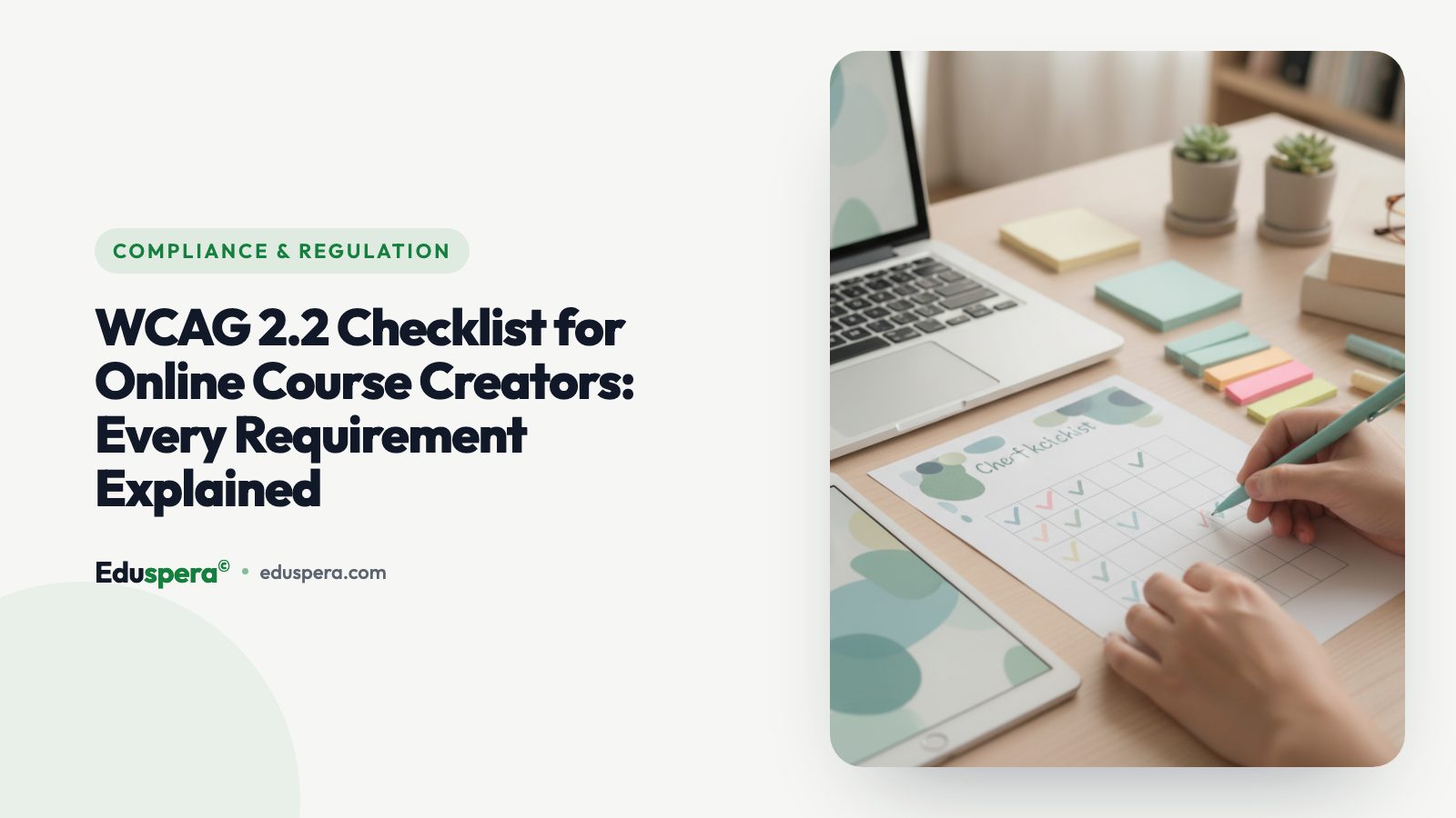
Creating an online course that looks polished and delivers great content is only half the job. If learners with disabilities cannot perceive your videos, navigate your quizzes, or understand your instructions, your course is fundamentally broken for a significant portion of your audience. The Web Content Accessibility Guidelines (WCAG) 2.2, published by the W3C in October 2023, provide the definitive technical standard for making digital content accessible. This checklist translates every relevant WCAG 2.2 Level AA requirement into plain-English actions that online course creators and instructional designers can implement immediately.
WCAG 2.2 organizes its 56 success criteria under four principles, known by the acronym POUR: Perceivable, Operable, Understandable, and Robust. Each principle addresses a different dimension of accessibility. This article walks through the criteria most relevant to online courses, explains what each one means in practice, provides implementation guidance, and flags the mistakes that course creators most commonly make.
Use this as a working reference. Print it, bookmark it, or share it with your team. If you are building courses on Eduspera, many of these checks are automated through the platform's built-in accessibility score — but understanding the underlying requirements makes you a better course creator regardless of the tools you use.
Principle 1: Perceivable
Content must be presented in ways that all users can perceive — whether through sight, hearing, or touch. For course creators, this principle governs how you handle images, video, audio, color, and text formatting.
1.1.1 Non-Text Content (Level A)
What it means: Every non-text element — images, diagrams, charts, icons, infographics — must have a text alternative that conveys the same information. Screen readers cannot interpret pixels; they read the alternative text you provide.
How to implement for online courses:
- Write descriptive
altattributes for every image in your course materials. A diagram showing "Three stages of the design thinking process: Empathize, Define, Ideate" needs an alt text that names those stages, not just "diagram." - For complex infographics, provide a long description in the surrounding text or link to a detailed text version.
- Decorative images (visual separators, background patterns) should use an empty
alt=""so screen readers skip them entirely. - Icons used as buttons or links must have accessible labels — either visible text or
aria-labelattributes.
Common mistakes:
- Using filenames as alt text (e.g.,
alt="IMG_2847.jpg"). - Writing alt text that says "image of" — the screen reader already announces it as an image.
- Leaving alt text blank on informational images, making them invisible to screen reader users.
1.2.2 Captions (Prerecorded) (Level A)
What it means: All prerecorded video with audio must include synchronized captions. This is non-negotiable — captions are not a nice-to-have feature for online courses; they are a baseline requirement.
How to implement for online courses:
- Use AI transcription tools (such as OpenAI Whisper) to generate initial captions, then review and correct them manually. Automated captions typically achieve 90-95% accuracy, but that remaining 5% often lands on technical terminology, proper nouns, and domain-specific jargon — exactly the words your learners need to understand.
- Ensure captions are synchronized with the audio — timing matters. A caption that appears two seconds late breaks the learning experience.
- Include speaker identification when multiple people are speaking.
- Caption meaningful sound effects (e.g., "[applause]", "[phone ringing]") that contribute to comprehension.
Common mistakes:
- Relying solely on auto-generated captions without reviewing them.
- Using burned-in (open) captions with low contrast or small font sizes.
- Omitting captions on "short" videos — the requirement applies to all durations.
1.2.5 Audio Description (Prerecorded) (Level AA)
What it means: When your video shows visual information that is not described in the audio track — such as on-screen text, demonstrations, or visual transitions — you must provide an audio description narrating those visual elements.
How to implement for online courses:
- The simplest approach: narrate everything you show. If you are demonstrating a software interface, describe what you are clicking and what appears on screen as you do it. This technique, called "self-describing video," eliminates the need for a separate audio description track in most instructional contexts.
- For videos where visual content is essential but not narrated (e.g., a silent demonstration or a time-lapse), provide a separate audio description track or an extended text description.
Common mistakes:
- Saying "as you can see here" without describing what "here" shows.
- Relying on screen recordings without narrating the actions being performed.
- Showing on-screen code or formulas without reading them aloud.
1.4.3 Contrast (Minimum) (Level AA)
What it means: Text must have a contrast ratio of at least 4.5:1 against its background. Large text (18pt or 14pt bold) requires at least 3:1. This ensures readability for users with low vision or color vision deficiencies.
How to implement for online courses:
- Check your slide decks, thumbnails, and on-screen text overlays using a contrast checker tool (WebAIM Contrast Checker, for example).
- Avoid placing text over busy photographic backgrounds — use a semi-transparent overlay if you must.
- Be especially careful with placeholder text in forms, which is often styled in light gray on white and fails contrast requirements.
Common mistakes:
- Using brand colors that look appealing but fail contrast ratios (common with pastel palettes).
- Forgetting to check contrast in hover, focus, and active states.
- Using light gray for "secondary" or "less important" text — if it is readable content, it needs full contrast.
1.4.5 Images of Text (Level AA)
What it means: Do not use images to display text when the same visual presentation can be achieved with actual styled text. Images of text cannot be resized, reflowed, or read by screen readers without alt text.
How to implement for online courses:
- Use real text (HTML, styled with CSS) for headings, captions, labels, and callouts rather than embedding them as graphics.
- When screenshots of text are necessary (e.g., showing a code editor), provide the text content as a code block or transcript nearby.
Common mistakes:
- Creating elaborate title slides as flat images instead of using styled text.
- Using screenshots of code instead of properly formatted code blocks with syntax highlighting.
1.4.11 Non-Text Contrast (Level AA)
What it means: User interface components (buttons, form fields, focus indicators) and meaningful graphics (icons, chart elements) must have a contrast ratio of at least 3:1 against adjacent colors.
How to implement for online courses:
- Ensure quiz buttons, progress bars, and navigation controls are clearly visible against their backgrounds.
- Check that chart colors are distinguishable — do not rely on color alone to differentiate data series. Add patterns, labels, or distinct shapes.
Common mistakes:
- Using thin, low-contrast borders on form inputs.
- Styling disabled buttons in a way that makes them indistinguishable from the background.
Principle 2: Operable
Users must be able to navigate and interact with your course using any input method — keyboard, switch device, voice control, or mouse. For course creators, this principle governs navigation, timing, and interactive elements.
2.1.1 Keyboard (Level A)
What it means: Every interactive element — buttons, links, form fields, video controls, quiz answers, navigation menus — must be operable using a keyboard alone. No functionality may require a mouse or trackpad exclusively.
How to implement for online courses:
- Test your entire course flow using only the Tab key (to move focus), Enter or Space (to activate), and arrow keys (within groups). If you cannot complete any action, it fails this criterion.
- Custom interactive elements (accordions, tabs, modal dialogs) need proper keyboard event handlers — not just click handlers.
- Ensure video players respond to keyboard shortcuts: Space for play/pause, arrow keys for seek, M for mute.
Common mistakes:
- Building drag-and-drop quiz interactions that have no keyboard alternative.
- Using
<div>elements styled as buttons withoutrole="button"andtabindex="0"— they look clickable but cannot receive keyboard focus. - Creating keyboard traps where focus enters a modal or video player but cannot exit without a mouse.
2.1.2 No Keyboard Trap (Level A)
What it means: If keyboard focus can move into a component, it must be able to move out of that component using standard keyboard interaction (typically Tab or Escape). Users must never get stuck.
How to implement for online courses:
- Test all embedded content (video players, interactive simulations, third-party widgets) by tabbing into them and verifying you can tab out.
- Modal dialogs should trap focus within the dialog while open but return focus to the trigger element when closed via Escape or a close button.
Common mistakes:
- Embedding third-party widgets (polls, whiteboards, code playgrounds) that capture keyboard focus without providing an escape mechanism.
- Infinite tab loops within complex interactive components.
2.4.7 Focus Visible (Level AA)
What it means: When an element receives keyboard focus, there must be a visible indicator — typically an outline or highlight — so keyboard users can see where they are on the page.
How to implement for online courses:
- Never remove the browser's default focus outline (
outline: none) without replacing it with an equally or more visible custom focus style. - Use a focus style that contrasts well against both light and dark backgrounds. A common pattern is a 2px solid outline with a contrasting color offset by a small gap.
- Test focus visibility on every interactive element: navigation links, lesson buttons, quiz options, video controls.
Common mistakes:
- Adding
*:focus { outline: none; }in CSS to "clean up" the design — this single line breaks keyboard accessibility across your entire course. - Using a focus color that blends with the element's background.
2.5.7 Dragging Movements (Level AA) — New in WCAG 2.2
What it means: Any functionality that uses a dragging movement (click-and-hold plus move) must also be achievable through a single pointer action without dragging, unless dragging is essential.
How to implement for online courses:
- If you have drag-and-drop quiz questions ("drag the label to the correct diagram area"), provide a dropdown or click-to-select alternative.
- Reorderable lesson lists should support "move up/move down" buttons in addition to drag handles.
Common mistakes:
- Assuming drag-and-drop is the only intuitive interaction — many users cannot perform dragging movements due to motor disabilities.
- Providing a keyboard alternative but not a single-pointer (click/tap) alternative — this criterion specifically addresses pointer input, not just keyboard.
2.4.4 Link Purpose (In Context) (Level A)
What it means: The purpose of each link can be determined from the link text alone, or from the link text together with its surrounding context. Screen reader users often navigate by tabbing through links — hearing "click here, click here, click here" is useless.
How to implement for online courses:
- Write descriptive link text: "Download the project brief (PDF, 2.3 MB)" instead of "Click here."
- For lesson navigation, use the lesson title as link text, not generic labels.
Common mistakes:
- Using "Read more" or "Learn more" as link text without additional context.
- Linking raw URLs as visible text — they are unreadable by screen readers and difficult for everyone.
2.2.1 Timing Adjustable (Level A)
What it means: If your course includes timed activities (quizzes, assessments), users must be able to turn off, adjust, or extend the time limit — with at least one of these options available.
How to implement for online courses:
- For timed quizzes, offer an option to request extended time or disable the timer entirely.
- Auto-advancing slideshows or carousels must have pause controls.
- Session timeouts should warn users before expiration and allow extension.
Common mistakes:
- Hard-coding quiz timers without any adjustment option — this disproportionately affects learners with cognitive disabilities, motor impairments, or those using assistive technology that slows interaction speed.
Principle 3: Understandable
Content and interface behavior must be understandable to all users. For course creators, this principle addresses language clarity, consistent navigation, and how your course handles user input — particularly in quizzes and forms.
3.1.1 Language of Page (Level A)
What it means: The default human language of each page must be programmatically determinable — typically via the lang attribute on the <html> element. Screen readers use this to select the correct pronunciation engine.
How to implement for online courses:
- Ensure your platform sets the correct
langattribute (e.g.,lang="en"for English,lang="es"for Spanish). - If your course contains passages in a different language, wrap them in a
spanordivwith the appropriatelangattribute so screen readers switch pronunciation.
Common mistakes:
- Using
lang="en"on a page that is entirely in Spanish — the screen reader will attempt English pronunciation on Spanish words. - Omitting the
langattribute entirely, forcing the screen reader to guess.
3.3.1 Error Identification (Level A)
What it means: When a user makes an input error (submitting a quiz, filling a form), the error must be automatically detected and described to the user in text. The error message must identify the specific field and describe the problem.
How to implement for online courses:
- When a quiz question is answered incorrectly, clearly indicate which question has an error and what type of response is expected.
- For registration or profile forms, display specific error messages next to the relevant field: "Email address must include an @ symbol" rather than a generic "Invalid input" banner at the top of the page.
- Use
aria-describedbyto programmatically associate error messages with their form fields, so screen readers announce the error when focus moves to the field.
Common mistakes:
- Indicating errors only through color (red border) without text — users who cannot perceive color miss the error entirely.
- Displaying a single "There were errors in your submission" message without specifying which fields need correction.
3.3.2 Labels or Instructions (Level A)
What it means: Form fields and interactive components must have labels or instructions that describe the expected input. Every text input, dropdown, checkbox, and radio button needs a visible, programmatically associated label.
How to implement for online courses:
- Use the
<label>element with aforattribute matching the input'sid, or wrap the input inside the label element. - For quiz questions, ensure the question text is programmatically associated with the answer options using fieldset/legend or
aria-labelledby. - Provide format hints where needed: "Date of birth (DD/MM/YYYY)" or "Password must be at least 8 characters."
Common mistakes:
- Using placeholder text as the only label — placeholders disappear when the user starts typing, leaving them without context.
- Relying on visual proximity (label appears near the field) without a programmatic association.
3.2.3 Consistent Navigation (Level AA)
What it means: Navigation mechanisms that appear on multiple pages (course sidebar, lesson navigation, progress bar) must appear in the same relative order each time. Users build spatial memory of your interface; changing the layout between pages disoriented them.
How to implement for online courses:
- Keep your course navigation (sidebar, breadcrumb, next/previous buttons) in a consistent position across all lessons.
- If you have a progress indicator, ensure it appears in the same location on every lesson page.
Common mistakes:
- Moving the "Next Lesson" button from the bottom of the content on some pages to the top on others.
- Showing different navigation elements on quiz pages versus lesson pages without clear reason.
3.3.8 Accessible Authentication (Minimum) (Level AA) — New in WCAG 2.2
What it means: Authentication processes must not require cognitive function tests (memorizing a password, solving a CAPTCHA, recognizing objects in images) unless an accessible alternative is available. Users must be able to authenticate via password managers, passkeys, copy-paste, or single sign-on.
How to implement for online courses:
- Do not block paste in password fields — this prevents password manager usage.
- Support OAuth/SSO login (Google, Microsoft) as an alternative to password-based authentication.
- If you use CAPTCHAs, provide an audio alternative or use invisible CAPTCHA techniques that do not require user interaction.
Common mistakes:
- Disabling paste on password fields for "security" — this actually reduces security by discouraging strong, unique passwords.
- Using image-based CAPTCHAs without any alternative.
3.2.6 Consistent Help (Level A) — New in WCAG 2.2
What it means: If your platform provides help mechanisms (contact information, FAQ links, chat support), they must appear in the same relative location across pages.
How to implement for online courses:
- Place your help/support link in a consistent location — typically the footer or a persistent navigation element.
- Ensure the help mechanism is available from within the course player, not just the main site.
Common mistakes:
- Providing a help chat widget on the marketing site but removing it from the course player interface.
Principle 4: Robust
Content must be robust enough to work reliably with current and future assistive technologies. For course creators, this principle governs how your course's HTML is structured and whether assistive technologies can interpret it correctly.
4.1.2 Name, Role, Value (Level A)
What it means: Every user interface component must expose its name (label), role (what type of element it is), and current value or state to assistive technologies. This is how screen readers know that something is a button, whether a checkbox is checked, or what a slider's current value is.
How to implement for online courses:
- Use semantic HTML elements:
<button>for actions,<a>for navigation,<input type="checkbox">for checkboxes. These expose role and state automatically. - When using custom components, apply appropriate ARIA roles and properties:
role="tabpanel",aria-selected="true",aria-expanded="false". - For quiz progress indicators, use
role="progressbar"witharia-valuenow,aria-valuemin, andaria-valuemax.
Common mistakes:
- Building a custom video player with
<div>buttons that have no ARIA roles — screen readers cannot identify them as interactive. - Using
aria-labelthat contradicts the visible text — screen reader users hear one thing while sighted users see another.
4.1.3 Status Messages (Level AA)
What it means: Status messages — success confirmations, error counts, progress updates — must be announced to assistive technologies without receiving focus. Users should not have to hunt for changes on the page.
How to implement for online courses:
- Use ARIA live regions (
role="status"orrole="alert") for messages like "Quiz submitted successfully" or "3 of 10 questions answered." - For real-time progress updates (upload progress, lesson completion), use
aria-live="polite"so the announcement does not interrupt the user's current activity. - For critical errors, use
role="alert"which triggers an immediate announcement.
Common mistakes:
- Displaying a success toast notification that is visible on screen but not announced to screen readers.
- Using
aria-live="assertive"for non-critical updates, causing disruptive interruptions.
Semantic HTML Structure
What it means: Your course content should use proper HTML semantics — headings (<h1> through <h6>) in logical order, lists for listed items, tables for tabular data, and landmarks (<nav>, <main>, <aside>) for page regions. This is foundational to assistive technology support.
How to implement for online courses:
- Structure your lesson content with a clear heading hierarchy: one
<h1>for the lesson title,<h2>for major sections,<h3>for subsections. Never skip heading levels. - Use
<ul>or<ol>for lists — screen reader users rely on list semantics to understand the structure and count of items. - Wrap your course navigation in a
<nav>landmark so screen reader users can jump directly to it.
Common mistakes:
- Using bold text to simulate headings — it looks like a heading visually but is invisible to the heading navigation feature of screen readers.
- Nesting content in generic
<div>elements without any semantic meaning.
Correct ARIA Usage
What it means: ARIA (Accessible Rich Internet Applications) attributes supplement HTML semantics for complex widgets. However, incorrect ARIA is worse than no ARIA — it actively misleads assistive technologies.
How to implement for online courses:
- Follow the first rule of ARIA: if you can use a native HTML element that already has the semantics you need, use it instead of adding ARIA to a generic element.
- If you must use ARIA, follow the WAI-ARIA Authoring Practices Guide for the specific pattern (tabs, accordions, dialogs, etc.).
- Test with a screen reader — NVDA (free, Windows), VoiceOver (built-in, macOS/iOS), or TalkBack (built-in, Android).
Common mistakes:
- Adding
role="button"to a<div>but forgetting to add keyboard event handlers — the element announces as a button but does not respond to Enter or Space. - Using
aria-hidden="true"on content that is visible and interactive — this hides it from screen readers while it remains visible on screen, creating a confusing disconnect.
Printable WCAG 2.2 Checklist for Course Creators
Use this checklist to audit your course content before publishing. Each item maps to a specific WCAG 2.2 success criterion.
Perceivable
- ☐ All images have descriptive alt text (1.1.1)
- ☐ Decorative images use empty alt attributes (1.1.1)
- ☐ All videos have accurate, synchronized captions (1.2.2)
- ☐ Videos with visual-only information have audio descriptions (1.2.5)
- ☐ Text contrast ratio is at least 4.5:1 (1.4.3)
- ☐ Large text contrast ratio is at least 3:1 (1.4.3)
- ☐ UI component contrast ratio is at least 3:1 (1.4.11)
- ☐ Real text is used instead of images of text (1.4.5)
- ☐ Content is readable when zoomed to 200% (1.4.4)
- ☐ Information is not conveyed by color alone (1.4.1)
Operable
- ☐ All interactive elements are keyboard accessible (2.1.1)
- ☐ No keyboard traps exist anywhere in the course (2.1.2)
- ☐ Focus order follows a logical sequence (2.4.3)
- ☐ Focus indicator is clearly visible on all elements (2.4.7)
- ☐ Link text describes the destination or purpose (2.4.4)
- ☐ Page titles are descriptive and unique (2.4.2)
- ☐ Drag-and-drop has a click/tap alternative (2.5.7)
- ☐ Timed activities can be extended or disabled (2.2.1)
- ☐ No content flashes more than 3 times per second (2.3.1)
- ☐ Skip navigation link is available (2.4.1)
Understandable
- ☐ Page language is set via the lang attribute (3.1.1)
- ☐ Form errors are identified in text with specific descriptions (3.3.1)
- ☐ All form fields have visible, associated labels (3.3.2)
- ☐ Navigation is consistent across all pages (3.2.3)
- ☐ Help mechanisms appear in a consistent location (3.2.6)
- ☐ Authentication does not require cognitive function tests (3.3.8)
- ☐ Error suggestions are provided when possible (3.3.3)
- ☐ Content uses clear, plain language appropriate to the audience
Robust
- ☐ Semantic HTML elements are used correctly (4.1.2)
- ☐ Custom components have appropriate ARIA roles and states (4.1.2)
- ☐ Status messages use ARIA live regions (4.1.3)
- ☐ Content works with major screen readers (NVDA, VoiceOver, JAWS)
- ☐ Heading hierarchy is logical and sequential
- ☐ HTML validates without critical errors
How Eduspera Automates WCAG Compliance
Building an accessible course from scratch is a substantial effort — but it does not have to be a manual one. Eduspera integrates accessibility checks directly into the course creation workflow, catching issues before they reach your learners.
- Accessibility score: Every course receives a real-time accessibility score based on automated WCAG 2.2 AA checks. The score updates as you add content, flagging missing alt text, contrast issues, and structural problems immediately.
- AI-powered captions: Videos uploaded to Eduspera are automatically transcribed using AI, generating captions that you can review and edit directly within the platform — addressing SC 1.2.2 without requiring separate tools or workflows.
- Keyboard-first design: The entire course player — navigation, video controls, quizzes, and progress tracking — is built with full keyboard accessibility from the ground up, not retrofitted.
- Semantic HTML output: Course content authored in Eduspera's rich text editor automatically produces clean, semantic HTML with proper heading hierarchy, list structures, and ARIA attributes.
- Accessible quiz engine: Quiz components include proper labels, error messages, and focus management out of the box, addressing multiple WCAG criteria (3.3.1, 3.3.2, 2.1.1, 4.1.2) without requiring technical knowledge from course creators.
The goal is not to replace your understanding of accessibility — this checklist exists because understanding the principles matters. The goal is to automate the repetitive checks so you can focus on creating excellent educational content that serves every learner. Read more about how to make online courses accessible for a broader perspective on accessible instructional design.
Frequently Asked Questions
Do I need to meet WCAG Level A, AA, or AAA for my online course?
WCAG Level AA is the internationally recognized standard for web accessibility compliance and is the level referenced by most legislation, including the European Accessibility Act, the Americans with Disabilities Act (in practice), and Section 508. Level A is the absolute minimum and is insufficient for compliance. Level AAA includes enhanced criteria that are valuable but not typically required — many AAA criteria are impractical to apply universally (for example, requiring sign language interpretation for all video content). Target Level AA as your baseline, and adopt individual AAA criteria where they benefit your specific learner population.
What tools can I use to test my course for WCAG compliance?
Automated tools catch approximately 30-40% of WCAG issues. Use axe DevTools (browser extension), WAVE, or Lighthouse for automated scanning. For the remaining 60-70%, manual testing is essential: navigate your course using only a keyboard, test with a screen reader (NVDA on Windows, VoiceOver on macOS), verify color contrast with WebAIM's Contrast Checker, and ask users with disabilities to test your course. Platforms like Eduspera integrate automated accessibility scanning directly into the authoring workflow, catching common issues before you publish.
Can I retrofit an existing course for WCAG compliance, or do I need to rebuild from scratch?
Retrofitting is almost always possible and usually more practical than rebuilding. Start by running an automated scan to identify the most common issues — missing alt text, insufficient contrast, unlabeled form fields — as these can often be fixed quickly. Then address structural issues: heading hierarchy, keyboard navigation, and focus management. The most time-intensive fix for most course creators is adding captions to existing videos, but AI transcription tools have dramatically reduced the effort required. Prioritize fixes by impact: barriers that completely block access (keyboard traps, missing captions) should be fixed first, followed by issues that degrade the experience (poor contrast, missing alt text).
Related articles

Compliance & Regulation
WCAG Compliance Training for Enterprise: Building an Accessible L&D Program
At enterprise scale, accessible training is a governance problem as much as a design one. Here is how large organisations build a WCAG-compliant L&D program that holds up to procurement and audit.
Compliance & Regulation
Section 508 & ADA Compliance for Online Training: A US Guide
For US organisations, online training sits squarely inside Section 508 and ADA obligations. Here is who must comply, how WCAG fits in, and what to document to reduce legal risk.
Compliance & Regulation
Color Contrast for WCAG 2.2 AA: A Practical Guide for Course Creators
Colour contrast is the most common — and most fixable — accessibility failure in online courses. This guide explains the WCAG 2.2 AA ratios in plain terms and shows you how to measure and fix them.