Compliance & Regulation
Color Contrast for WCAG 2.2 AA: A Practical Guide for Course Creators
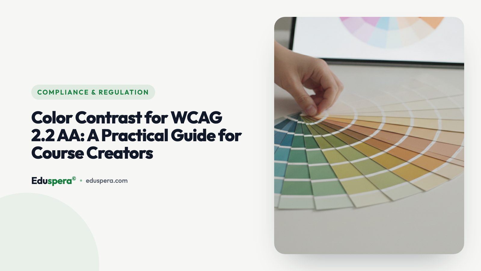
Colour contrast is the single most common accessibility failure on the web — year after year, automated surveys of the top million home pages find low-contrast text on more than four out of five of them — and it is also one of the easiest issues to fix. For course creators, getting contrast right means low-vision learners, people with colour-vision deficiencies (about 1 in 12 men), and anyone reading on a glary phone screen in bright sunlight can actually read your content. This guide explains the WCAG 2.2 AA contrast requirements in plain language — the 4.5:1 and 3:1 ratios, what counts as "large" text, and the frequently forgotten rules for buttons, icons and charts — then shows you exactly how to measure contrast and fix failures without throwing away your brand.
What contrast ratio actually measures
A contrast ratio is a number describing the difference in relative luminance (perceived brightness) between two colours — typically text and the background behind it. It runs from 1:1 (identical, invisible) to 21:1 (pure black on pure white). It is not about hue: two colours can look very different and still have poor contrast if they are similarly bright (think mid-blue text on a mid-green background).
This is why you cannot eyeball it reliably. A colour that looks fine to you on a calibrated monitor in a dim office may be illegible to a learner with low vision on a cheap phone outdoors. WCAG turns the judgement into a measurable threshold so it is testable and objective.
The contrast ratios you actually need
For Level AA, these are the thresholds to hit:
- 4.5:1 — minimum for normal body text (WCAG 1.4.3).
- 3:1 — minimum for large text, defined as 18.66px bold or 24px regular and above (about 14pt bold / 18pt regular).
- 3:1 — minimum for non-text contrast (WCAG 1.4.11): the meaningful parts of UI components such as input borders, toggle states and the essential shapes of icons, plus graphics needed to understand content.
Level AAA raises body text to 7:1, which is worth aiming for on long-form reading and is comfortably achievable with near-black text on white. But AA is the legal baseline, and meeting it consistently across a whole course is the realistic goal. Note that logos and purely decorative elements are exempt — the rules target content learners need to read or operate.
The contrast mistakes course creators make most
Almost all failures cluster around a handful of patterns, and once you know them you will spot them everywhere:
- Light grey text on white — elegant in a mockup, unreadable for many. Grey-on-grey captions and faint metadata are frequent offenders.
- Brand-colour buttons with white text, where the brand colour is too light to reach 4.5:1 — extremely common with pastel or neon brand palettes.
- Text over images or video with no scrim or overlay, so contrast changes with every frame and fails somewhere.
- Placeholder text used as labels — usually far too faint, and it disappears once the field is filled.
- Colour-only meaning — "click the green button" or red/green pass/fail with no icon or text, which also fails WCAG 1.4.1 (use of colour).
- Low-contrast charts where adjacent segments are indistinguishable, especially for colour-blind viewers — add labels or patterns.

How to measure contrast
You never have to guess. Use any of these free tools:
- Browser DevTools — Chrome and Firefox show the contrast ratio directly in the colour picker and the accessibility inspector, including a pass/fail line.
- WebAIM Contrast Checker — paste two hex values and get the exact ratio plus pass/fail for AA and AAA, normal and large text.
- axe-core / Lighthouse — automated scans flag every contrast failure across a whole page at once, which is ideal for auditing an existing course.
- Colour-blindness simulators — preview your palette under deuteranopia, protanopia and tritanopia to catch charts and status colours that collapse.
Make contrast a routine step in your course audit rather than a final-day surprise — it is far cheaper to fix a token than to recolour 40 lessons.
How to fix contrast without ruining your brand
Contrast and good design are not in conflict; you just need a system instead of one-off tweaks:
- Darken text, not the whole palette. A slightly darker shade of your brand colour, used specifically for text, often passes while staying recognisably on-brand.
- Reserve light brand tints for backgrounds and accents, never for body text or critical icons.
- Add a scrim or overlay behind text on imagery so the ratio is stable regardless of the photo.
- Pair colour with shape, icon or text so meaning never depends on colour alone.
- Define accessible colour tokens once — a contrast-checked design system (text colour, button colour, link colour, focus colour) means every new lesson starts compliant and no creator has to re-test.
- Keep a dark-mode and high-contrast variant in mind, since the same tokens need to pass on both backgrounds.
One mindset shift makes all of this easier: stop thinking of contrast as a per-element decision and start thinking of it as a property of your design system. A brand has dozens of possible colour pairings, but a course only needs a handful — body text, headings, links, buttons, borders, focus and a couple of accents. Define those once, prove each passes, and the question "does this pass contrast?" is answered before any lesson is written. The creators using your templates then never have to think about ratios at all, which is exactly how it should be: accessibility that is invisible to the people producing content because it is built into the tools they start from.
Contrast in dark mode, on video and in charts
Three contexts deserve special attention because a palette that passes in one can fail in another. Dark mode inverts the problem: now you need light text on dark backgrounds to hit 4.5:1, and pure white on pure black can actually be uncomfortably harsh — a slightly softened off-white is both more comfortable and still compliant. If you offer light and dark themes, every token has to pass on both.
Text over video or images is the hardest case because the background changes constantly. You cannot guarantee contrast against an unknown frame, so add a semi-opaque scrim behind the text, or place text in a solid panel. Caption text specifically should sit on a solid or semi-opaque background so it is legible over any scene.
Charts and data visualisation fail in a different way: adjacent segments that are distinct in colour but similar in brightness become indistinguishable for colour-blind viewers, and a legend that relies purely on colour fails 1.4.1. Fix it by adding direct labels, patterns or textures, ensuring 3:1 between adjacent meaningful areas, and testing the chart through a colour-blindness simulator.
Build an accessible colour system in five steps
The durable fix for contrast is a small, tested colour system rather than per-page tweaks. Here is a practical sequence:
- Pick a text colour that passes on your main background. Start near-black on white (or near-white on your dark background) and only lighten/darken until you are comfortably past 4.5:1.
- Derive an accessible "brand text" shade. If your brand colour is too light for text, define a darker variant used specifically for links and emphasis that still reads as your brand.
- Define button tokens. Choose a button background dark enough for white (or dark) label text to reach 4.5:1, and a clearly visible focus colour that meets 3:1 against adjacent colours.
- Set a UI/border token at 3:1. Input borders, toggles and icon shapes need non-text contrast (1.4.11), so do not let them fade into the background.
- Test the whole set once, then reuse it. Run every token pair through a contrast checker, save the values, and build all lessons from them. New content is then compliant by construction.
Aim for AA everywhere and AAA (7:1) on long-form body text where you can — it costs little with near-black text and noticeably improves readability for everyone.
An efficient contrast-testing workflow
Checking contrast colour-by-colour does not scale to a course with dozens of lessons. A faster workflow tests the system once and then spot-checks content:
- Audit the design tokens, not every page. If your text, link, button, border and focus colours all pass against your background(s), the vast majority of your content passes automatically.
- Run a full-page automated scan with axe-core or Lighthouse on a representative lesson, a quiz and the dashboard — these surface contrast failures in bulk with the exact elements named.
- Spot-check the risky content types by hand: text over images, charts, badges and status pills, and any creator-chosen colours.
- Simulate colour blindness on anything that uses colour to convey meaning.
- Re-test only what changes. Because the tokens are fixed, you mostly need to check new custom colours, not the whole library again.
Bake this into your publishing checklist so contrast is verified before a lesson goes live, not after a learner complains. The cost of prevention is a few minutes; the cost of remediation is recolouring an entire course.
Quick reference: ratios, checks and fixes
Keep this summary to hand whenever you choose a colour or review a lesson:
- Normal text: at least 4.5:1 (AA). Aim for 7:1 (AAA) on long-form reading where you can.
- Large text (24px regular / 18.66px bold): at least 3:1.
- UI components and meaningful icon/graphic shapes: at least 3:1 (non-text contrast).
- Logos and decorative elements: exempt.
- Never rely on colour alone: pair it with text, an icon or a pattern.
- Measure, do not guess: WebAIM Contrast Checker, browser DevTools, or axe-core/Lighthouse for whole-page scans.
- Fix at the token level: darken text shades, reserve light tints for backgrounds, add scrims behind text on images, and test the system once.
When is AAA worth the extra effort? On dense, long reading — documentation, transcripts, lengthy lessons — where the higher 7:1 ratio measurably reduces eye strain for everyone and is easy to hit with near-black text on white. For buttons, labels and short UI text, solid AA is the pragmatic target. Either way, deciding once at the design-system level means every creator inherits accessible colour without thinking about it.
How Eduspera handles contrast for you
Eduspera ships contrast-checked themes, so the default text, buttons and components already meet WCAG 2.2 AA — and a built-in brand-contrast check warns academy owners when a chosen brand colour would fail against white, suggesting an accessible alternative before it ever reaches a learner. Learners also get a high-contrast mode within the platform-wide reading aids. The result: creators get on-brand courses that stay readable, without manually testing every colour combination.
It is all part of an accessibility-first platform tested against WCAG 2.2 AA, priced at about half the big platforms, with free migration. Start free or read what makes an LMS genuinely compliant.
Frequently asked questions
What is the minimum colour contrast for WCAG 2.2 AA?
For normal body text the minimum is 4.5:1. For large text (18.66px bold or 24px regular and above) it is 3:1. UI components and meaningful graphics also need at least 3:1 (non-text contrast, WCAG 1.4.11). Level AAA raises body text to 7:1.
What counts as "large text" under WCAG?
Text that is at least 24px (about 18pt) regular, or 18.66px (about 14pt) bold. Large text only needs a 3:1 contrast ratio instead of the 4.5:1 required for normal text.
How do I check the contrast ratio of two colours?
Use the WebAIM Contrast Checker, your browser DevTools colour picker, or an automated scan with axe-core or Lighthouse. Paste your foreground and background colours to see the exact ratio and whether it passes AA and AAA for normal and large text.
Does colour contrast apply to buttons and icons too?
Yes. WCAG 1.4.11 requires at least 3:1 contrast for the meaningful parts of UI components (such as input borders and the essential shapes of icons) and for graphics needed to understand content — not just for text. Logos and purely decorative elements are exempt.
Does Eduspera check colour contrast automatically?
Yes. Eduspera ships contrast-checked themes that meet WCAG 2.2 AA by default and warns academy owners if a chosen brand colour fails against white, suggesting an accessible alternative — plus a high-contrast reading mode for learners.
Related articles

Compliance & Regulation
WCAG Compliance Training for Enterprise: Building an Accessible L&D Program
At enterprise scale, accessible training is a governance problem as much as a design one. Here is how large organisations build a WCAG-compliant L&D program that holds up to procurement and audit.
Compliance & Regulation
Section 508 & ADA Compliance for Online Training: A US Guide
For US organisations, online training sits squarely inside Section 508 and ADA obligations. Here is who must comply, how WCAG fits in, and what to document to reduce legal risk.

Compliance & Regulation
WCAG Compliance for Online Courses: A Complete 2026 Guide
WCAG can feel abstract until you map it to a real course. This complete guide translates WCAG 2.2 AA into the concrete things online courses must get right — and how to audit and maintain them.